


-
a Bedroom b
.jpg)
The above image is done using 3ds Max for modelling purpose and V-ray for rendering purpose. -
a Project 1: De Feringghi Hotel Lobby & Restaurant b
We went for a site visit to this hotel, and observe the space design. Then, based on the research we have done, we are required to redesign the lobby and restaurant for De Feringghi Boutique Hotel using the available space.
Design ConceptThe concept of the hotel is “dynamic of river”. Rivers are dynamic, continually changing in response to variations in weather, land-use and the supply of sediment. Hotels are also a place where customers staying there are always changing, as they only staying for a while on vacation or business purposes. Every day, the hotel deals with check-ins and check-outs of various types of customers from all over the world.This concept focus on the flowing, connecting, and leading characteristics shown in rivers. The dining areas partition are in curve shape as that a river has. And the curving space leads the customers from the main entrance to the lobby reception desk, and to the open garden space, finally up to the waxing room on the second floor. The partitions are using water walls to create dynamic in the space, and produce water flowing sound in the space. The Breakfast Area.
 The main Entrance. The walls beside are planted with green plants. Green walls have a lot of advantage. They help in noise reduction, improve indoor air quality and health, has cooling effect, and also create aesthetic appearance.
 The information counter is circle in shape with half of it located in the lobby area, and another half of it located in the restaurant area behind it. This circle is not a complete one as there are openings for the staff to enter, it imitates the shape of a oxbow lake which is a natural formation from a river.
 The Lobby Area.
The Sofa is in a "S" shape, and the legs of the coffee tables are twisting upwrads to join the base with the table top surface. The Garden Open Area.This area provides the tourists or customers a place to be close to the natural environment. They can have a walk here enjoying the sunlight.
 The Restaurant.All the furnitures are customized to suit with the concept of the hotel - “dynamic of river”. They are curvy in shape, which are same as that a river has.
 The Waxing Area.This is proposed in the design because we found out from the manager of the hotel that a lot of Arabian customer are searching for waxing service when they check in here, however they can hardly find any around this place.
 X:X Section
 Y:Y Section
 The Final Presentation Board.This is done using Adobe Illustrator, Photoshop, Sketchup, and V-ray.Below are some of the photos showing my monochrome model in a scale of 1:75.


 Several rivers are often connected and finally flow towards the sea. This concept is apply in the connection of the two dining areas. The restaurant and breakfast area are separated, however they are connected through the kitchen. Kitchens are connected directly to the restaurant and breakfast area for convenience of serving food.
 -
a Project 3: Museum Of Aur b
We are required to design a mini museum using a high cube container to relocate and exhibit valuable heritage artifacts. It will become a centre for the villagers in Kota Aur to display their cultural heritage crafts, tools and products. The small container museum will help in enhancing the aesthetic quality of the place and will help to increase their income level.
Design ConceptThe design concept used for this cabin mini museum is the spirit of Yin and Yang. From the artifacts found in Kota Aur, we noticed that all Muslims, Buddhist, and Hindus lived peacefully together, giving tolerances to each other to balance up their live circle. This is the spirit that are proposed by the Yin and Yang concept.
 Interior perspective view of the mini museum showing the information counter.
 Interior perspective view of the exhibition area.Yin and Yang are associated with opposite forces, such as hot and cold, light and dark, high and low, and stillness movement. Neither can exist in isolation, but they mutually influence each other. Yin and Yang also explains the body’s structure and function. The body is seen as a set of connected systems governed by the balance between Yin and Yang. this is shown in the layout plan where the information counter in the centre connects all the other four parts of the museum.
 Exterior perspective view of the Museum of Aur.
 Final Presentation Board.The whole layout plan is a curved shape inspired by the symbol of Yin and Yang, which is formed by using different colour of bamboo flooring. The concept is applied in the arrangement of cabinets with different heights, and in the dark and light coloured flooring. The whole floor plan is in a balance arrangement with the south part complements with the north part, the east part complement with the west part, and the ceiling complements with floor.
Scale 1:20 Monochrome Model
 Closer view of the model.
 Showing the details of cabinets and shelves in the model.
 Exterior view of the monochrome model.For the material finishes, dark red colour of the brushed bamboo wall and cabinet is chosen, which are representing fire are balanced by the water in the water flowing glass panel partitions. The flowing water through the glass panel also gives movement to the museum interior to balance up the stillness in the museum, and also allowing natural light to shine through the transparent slits on the roof.
 -
This coursework requires us to only use coloured pencil to show the shadings and highlights of different objects.
 We are asked to only use analogous colours - red, orange, and pink to show the shadows and reflections on the smooth surface of the helmet. Then, blue colour is used to colour the words.
 The objective of this assignment is to use coloured pencil to show the reflection and refraction of a glass of water, with a green coloured pencil being put inside this glass of water. Every details is very important to show the effect of reflection and refraction.
 -
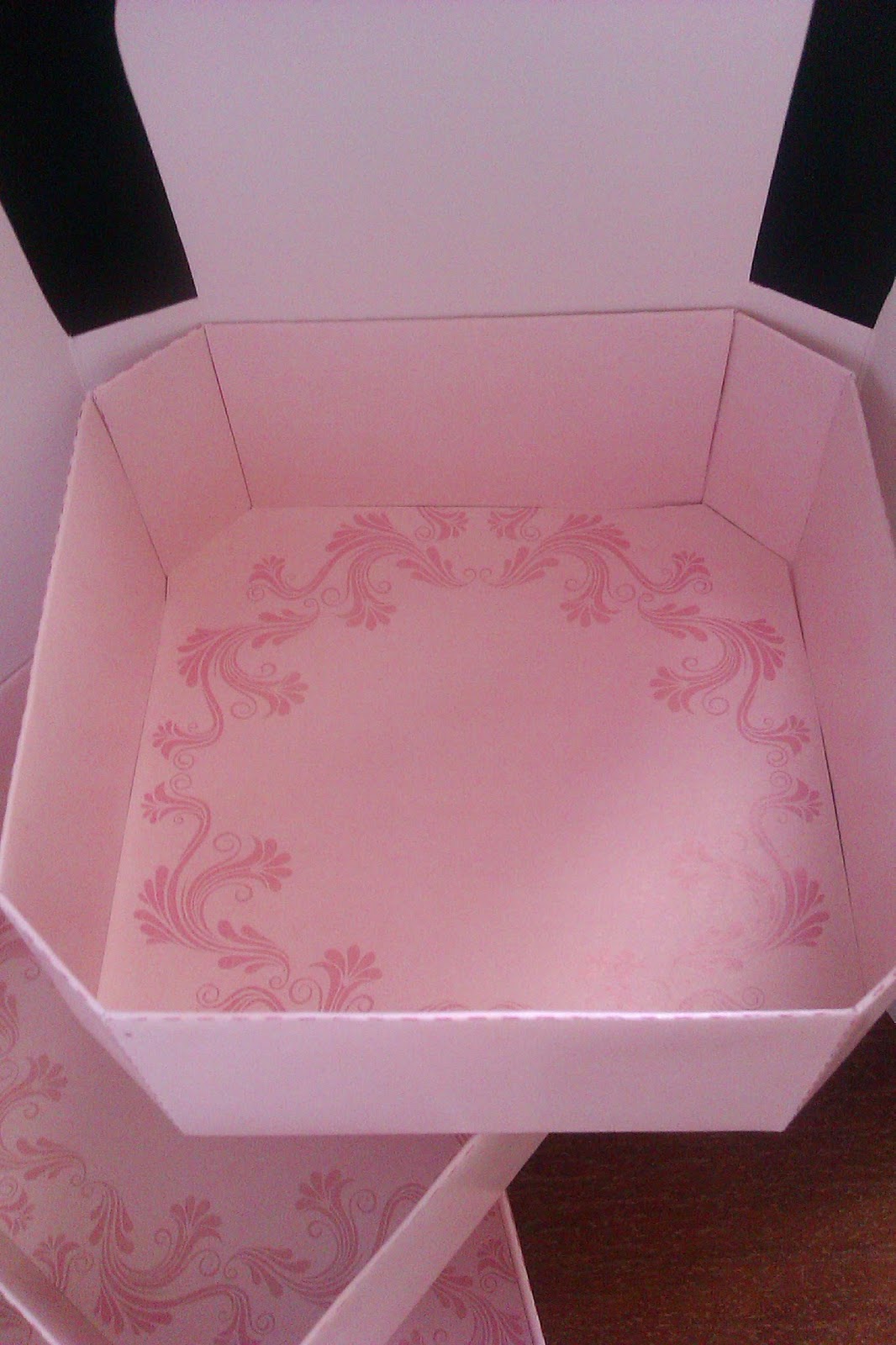
We are asked to design a packaging for the traditional Malaysia delicacies - Kuih Bahulu.Design ConceptVintage elements such as the floral frame are used in this packaging design to bring out the idea that this traditional delicacies are perfect for a english tea time with tea or coffee. Light peach and pink colours are used as the theme colour for the packaging box of “Kuih Bahulu” to give buyers the feeling of sweet, soft, and spongy same as that a kuih bahulu has. This is also used to attract customers especially the younger generation to try out this traditional Malaysian dessert.
 Front View
 Right View
Back View
Left View

Top ViewAxonometric view


The lids are composed of four petals.


The packaging is designed such that when it opens, the three layers are separated and spread out as shown above.
 Closer views of the inner boxes.
Subscribe to:
Comments (Atom)


